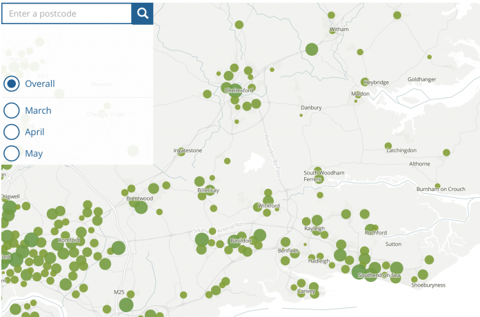
A new interactive map allows you to see how many coronavirus deaths there have been in your local area.
The map has been updated by the Office for National Statistics, and shows all deaths that occurred where Covid-19 was the underlying cause or mentioned on the death certificate as a contributory factor.
It is the most detailed picture of how Covid-19 has been affecting your neighbourhood so far and includes registered deaths between 1st March and 31st May.
The map shows that the worst hit areas are the larger towns in Essex such as Basildon, Chelmsford, Harlow and Southend, which have high death rates in their surrounding neighbourhoods.
Enter your postcode below to see the number of deaths in an area. The size of the circle represents the number of deaths.
There were 46,687 deaths in England and Wales between 1 March and 31 May 2020 and registered by 6 June 2020 that involved the coronavirus (COVID-19).
London had the highest age-standardised mortality rate with 137.6 deaths per 100,000 persons.
The statistics also confirmed that males had a significantly higher mortality rate than females, with the highest Covid-19 mortality rates for males in the London boroughs of Brent, Newham and Haringey. The highest outside London were Middlesbrough, Liverpool and Hertsmere.
The good news is that the overall number of people with Covid-19 in England is falling.
The number of average infections per day since the end of April has fallen from 5,600 new infections per day to 4,500, according to the latest figures.
To keep up with all the latest news across Essex, please like our Facebook Page or join our Essex Breaking News group.


